Text typeface for low budget editorial pieces
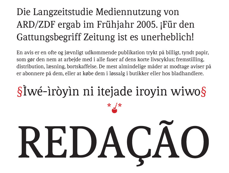
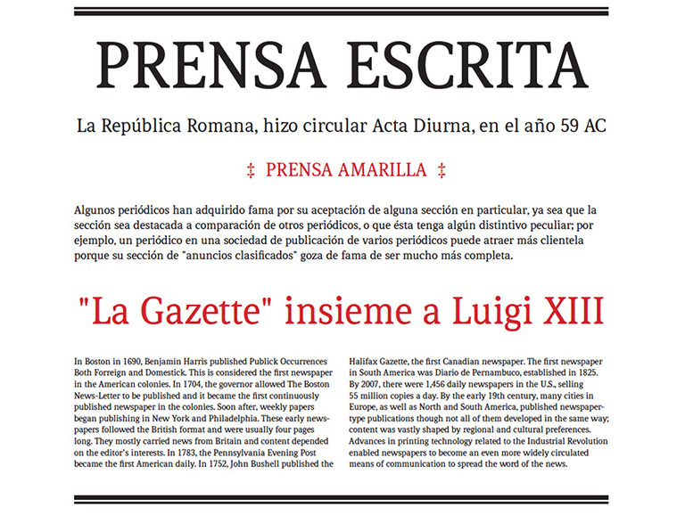
Tribuna is a text typeface for low budget editorial pieces. Relatively compressed letterforms with high performance as continuous text under the use and production conditions of newspapers and journals.
Tribuna highlights are:
a) Text performance without losing legibility or economy.
b) Use in low quality production conditions.
In few words: Tribuna is designed to reduce costs and obtain a smooth type page.


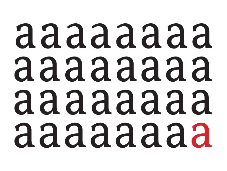
Very thin strokes were avoided as the production quality of many newspapers destroy them or make them disappear. So joints had to keep the ink controlled.
Upon evaluating the letter spacing and outer letterforms, I focused on serifs and their exterior counterforms so that they are not so open, thus minimizing vibration on the gutters in case of very narrow space between columns. Tribuna’s process is in line with my interest in studying the problems occurring in small text sizes.
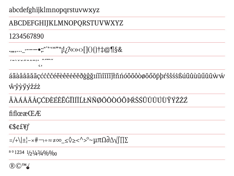
It has OpenType features for standard and discretionary ligatures, fractions.
To date, colors, bold and black are in process. There is a version with full glyphs for the Latin extended alphabet.


